Beginning
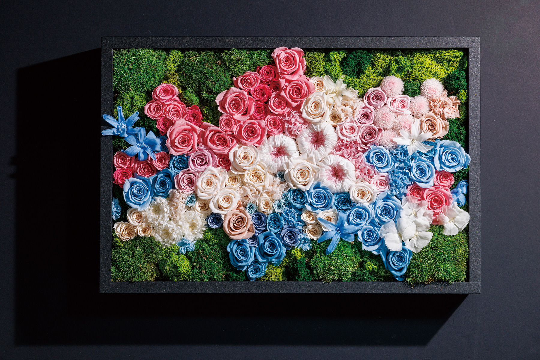
Nuanced White
Color Palette 1

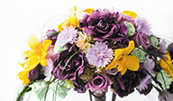
Color Palette 2

Keyword BeginningResetPeaceBalanceEternityUniversalBreathFuture
White is the color that represents the beginning and starting over.
It is known that when blending all the colors of light, it eventually becomes white. It is a hopeful color to encompass all for praying peace.
Usage Tips
Imagining the bright future full of light, use white as the base to make a gentle impression.
Add pale-toned colors to create nuances and expand the expression of white.
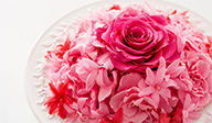
Palettes of calming and soothing tones bring a perfect balance of mind and body.
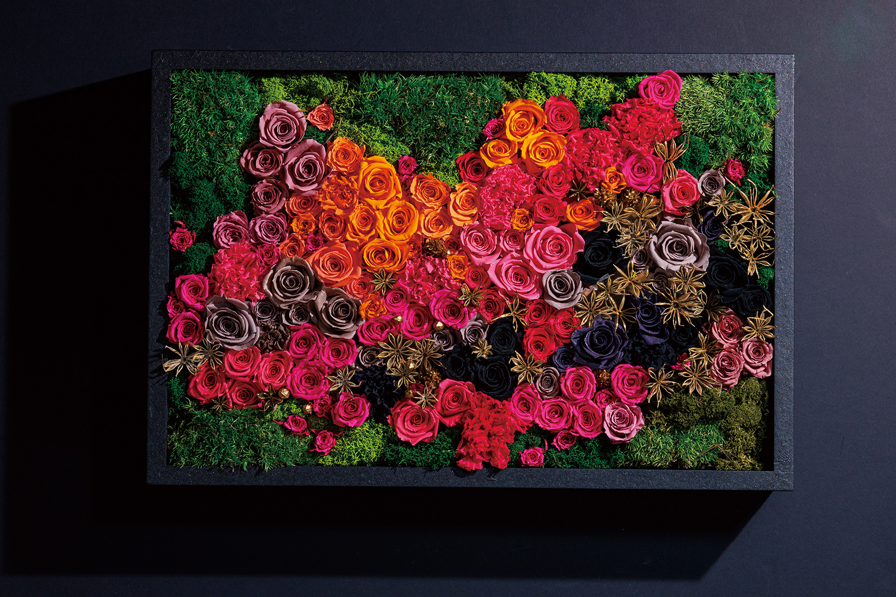
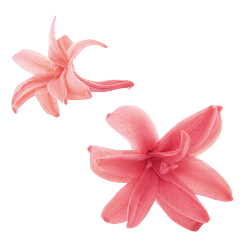
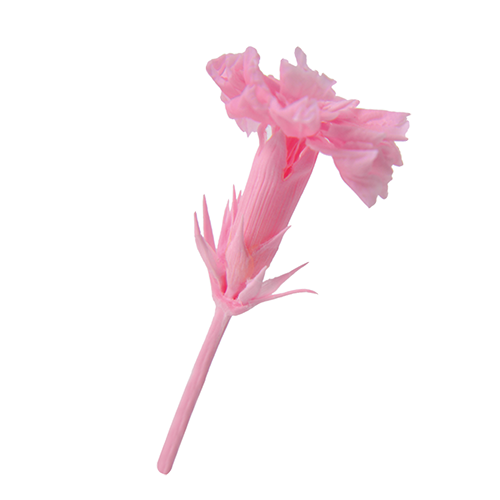
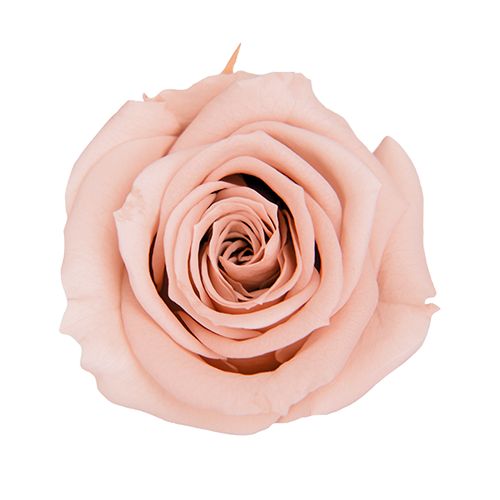
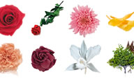
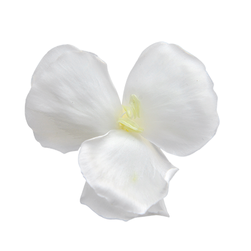
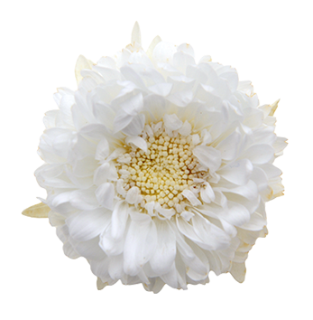
Products used in this arrangement
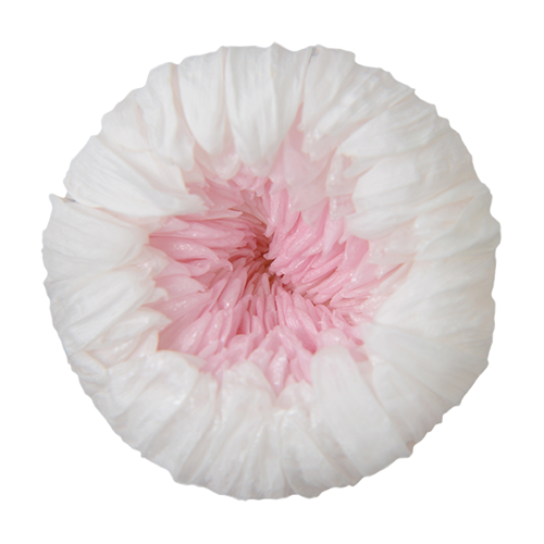
White×Pink
Pearl White
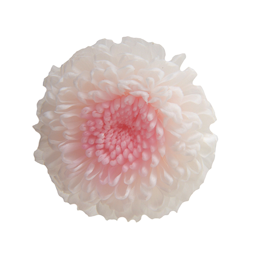
White×Pink
Pearl White
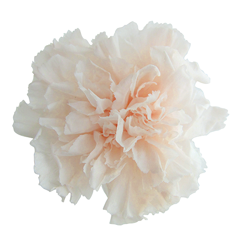
Panna Cotta
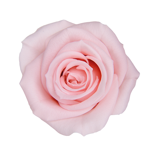
Milky Pink
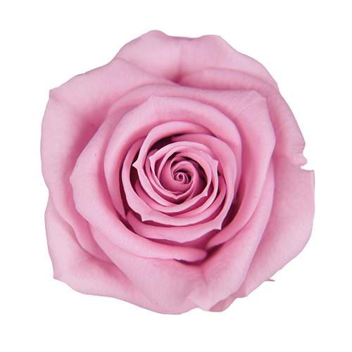
Lavender Pink
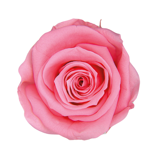
Sugar Pink
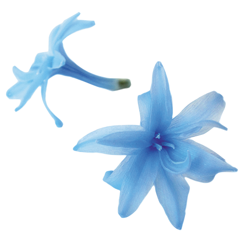
Powder Blue
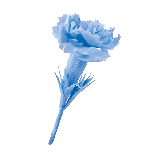
Powder Blue
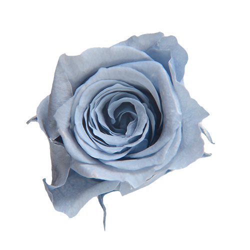
Cotton Blue
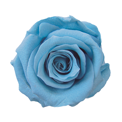
Horizon blue