Steps
Calming Grayish Colors
Color Palette1

Color Palette2

Keyword SoftWrapped upDozeNeutralTextureVagueRetro
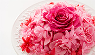
When the world is changing, there is ambivalence. Calming grayish colors can sooth your feelings, and wrap up your body and soul.
Usage Tips
Minimize the color saturation, and finish up with a calming impression. When color hues are too similar to each other, adding contrasting colors can accentuate the whole. Using mid-saturated colors as accent can finish the look with a gentle impression.


Designed by Norihiko Kamei
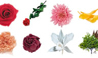
Products used in this arrangement

Nude Pink

Panna Cotta

Milky Pink

Fuchsia Pink

Pink

Baby Pink

Silky Gray

Pale Blue

Cotton Blue

Green Tea

Green

Gold